Disclaimer: While I make every
attempt to provide this information in a timely and accurate manner, I
cannot ensure all data is accurate at all times. Use of this data is on
an as-is basis, and no warranty is implied in making it available to any
who might choose to use it at their own risk.
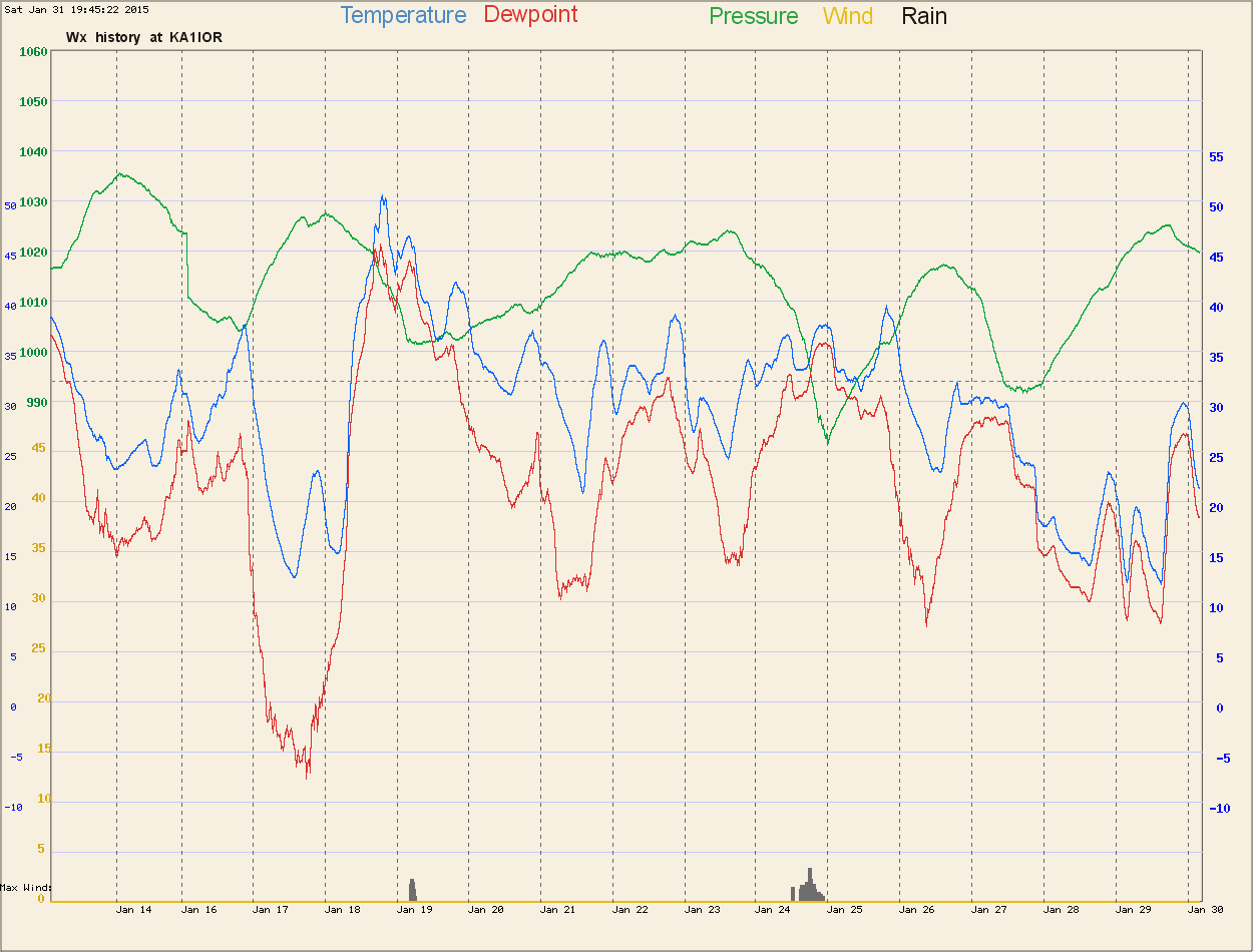
I created these charts to present the data in a concurrent form, so that
time is represented in a single horizontal vector of just one image, and
the interaction of the different variables can be compared directly along
the vertical axis. Many commercially made programs show the data components
separately, and they must be overlaid in the mind, which is nearly impossible
for some people to do. Other features in some of the charts
include:
-
A floating temperature range scale, intended to position the temperature
and dewpoint data plots favorably within the chart.
-
A comfort level indicator on the 60 degree mark when humidity is high
-
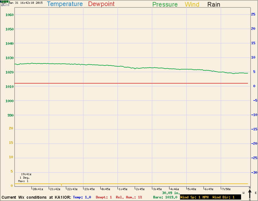
A freezing point line
-
A descending secondary blue temperature line to indicate the effects
of wind chill
-
Sunrise (yellow) and Sunset (red) times indicated by a dashed line on
the 3-day chart.
These are not fixed features, but are intended to only appear when the
feature has relevance. Thus, the red 60 degree mark will only show when
the plot indicates uncomfortably humid conditions. The wind chill is not
usually visible when the temperature is over 60 degrees.
-
Station Equipment: LaCrosse WS-2315, AMD 1.5Ghz, Win98,
APC UPS for power redundancy.
-
Graphing software: Written by KA1IOR using PERL,
and employing the FLY program
for painting the image.
-
This chart is normally updated on 20 minute intervals, but I put it to 5 minutes when regional
conditions warrant,
such as during storm events. The page is pre-set to refresh at 5 minute intervals. All times shown
in chart are
UTC.
|